Goals
To develop a document management system from scratch to replace the legacy platform
- Enhance scalability from both a technical and UX perspective,
- Cut maintenance expenses by favoring in-house solutions,
- Implement the corporate visual language and design system,
- Improve user experience and ensure alignment with other enterprise systems.
My role
- UX/UI/Product design
- User research
- Wireframes / Prototypes
- Stakeholder management
- Design hand-off
- Reviews and docs
- Presentations
- Facilitating workshops
- Feature proposals
- Design system development
- Team consultancy
Team
- 3 key stakeholders
- Product Owner
- 3 Analysts
- UX/Product Designer
- 6-8 Developers
- 2 QA
Duration
>3,5 years
Tools
Figma, Miro, Jira, Confluence, ChatGPT, Illustrator, Kendo UI
Result
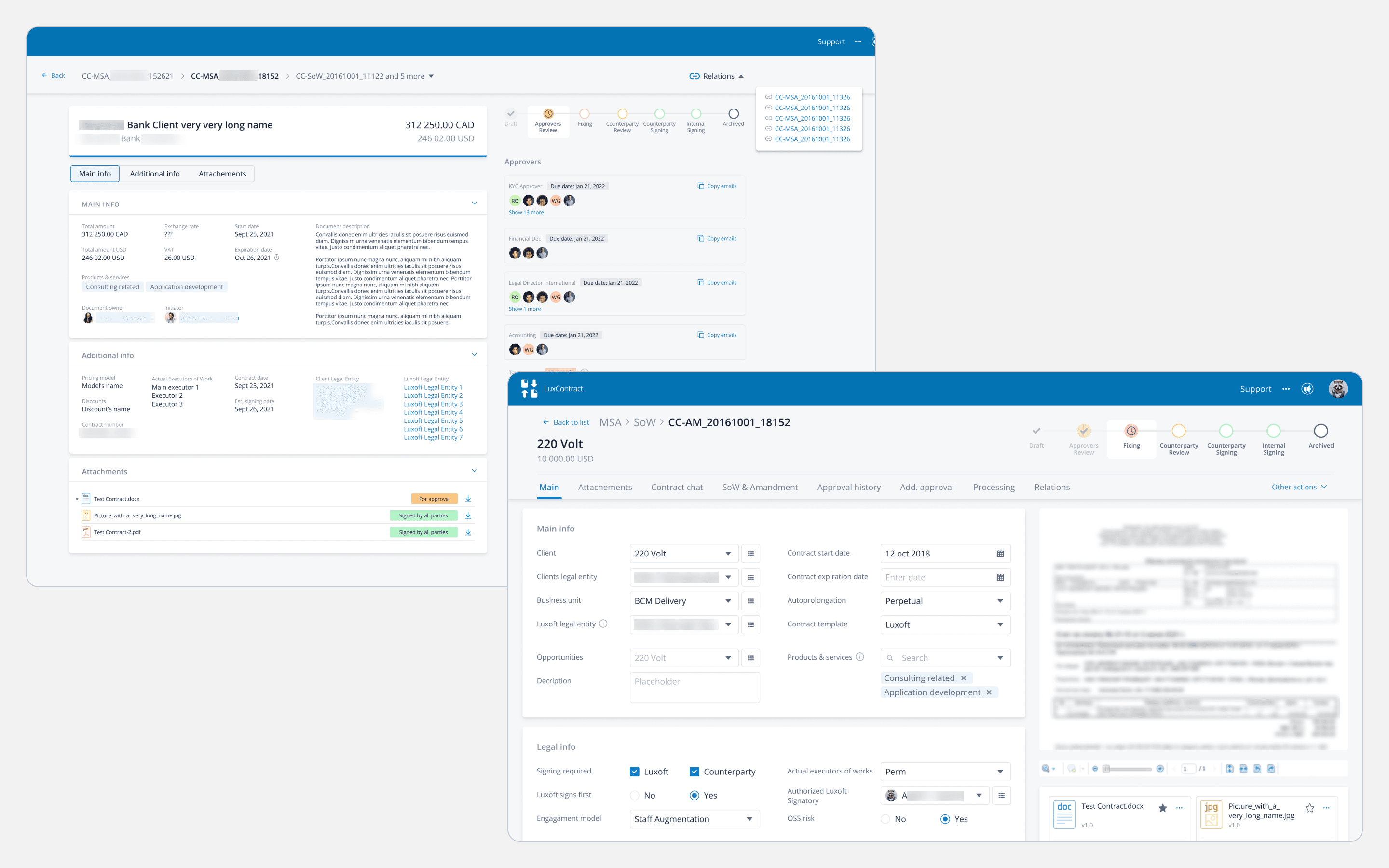
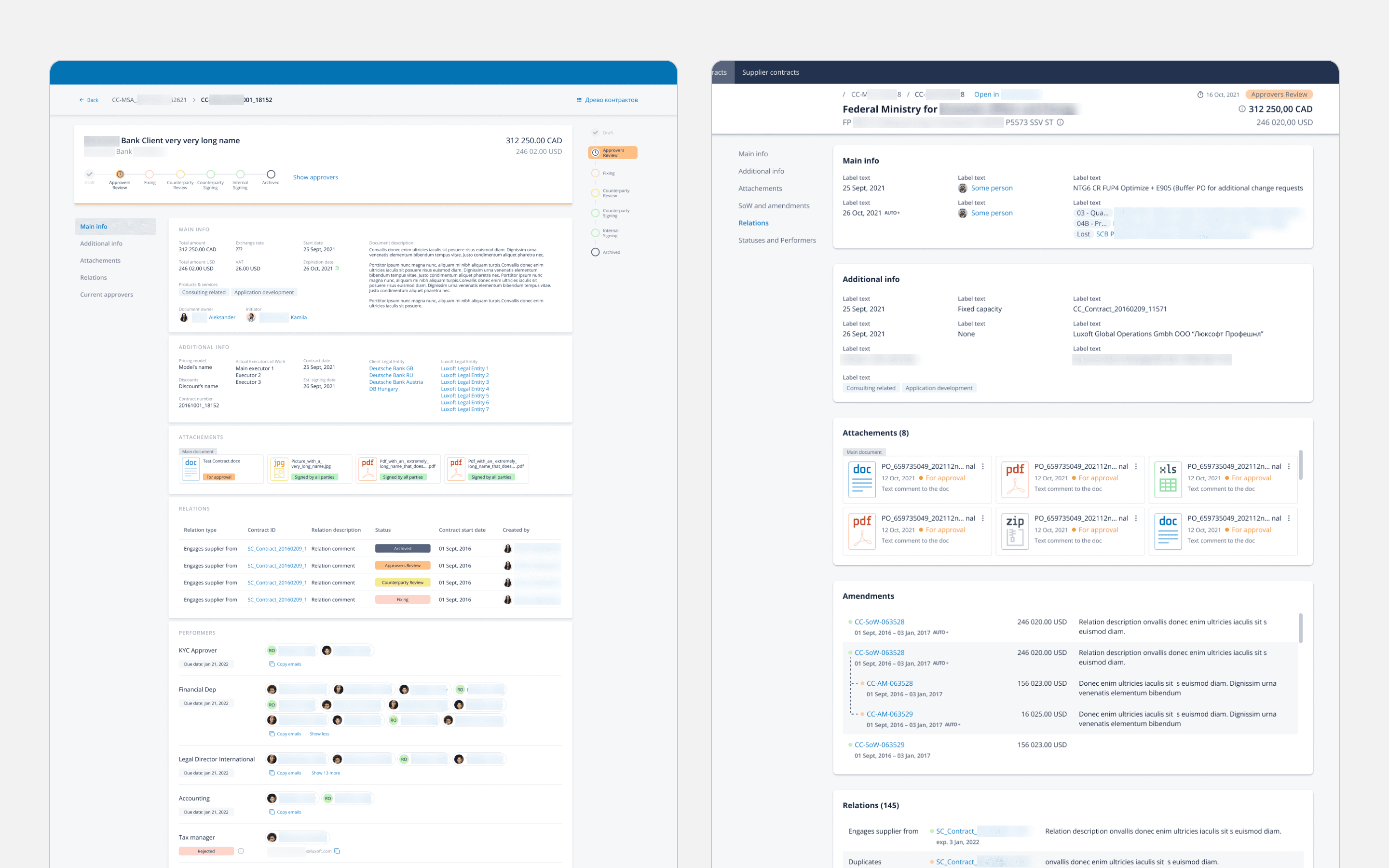
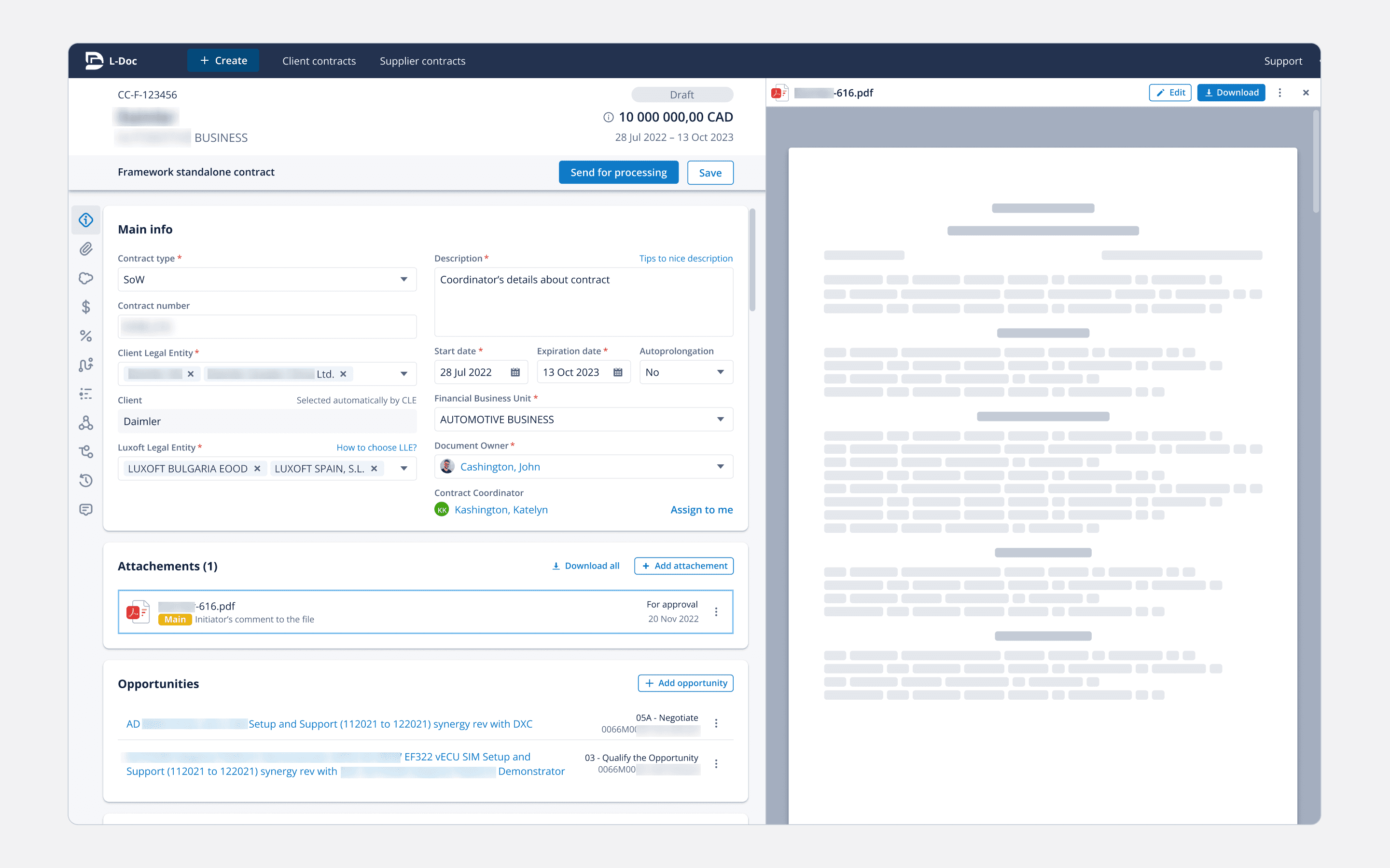
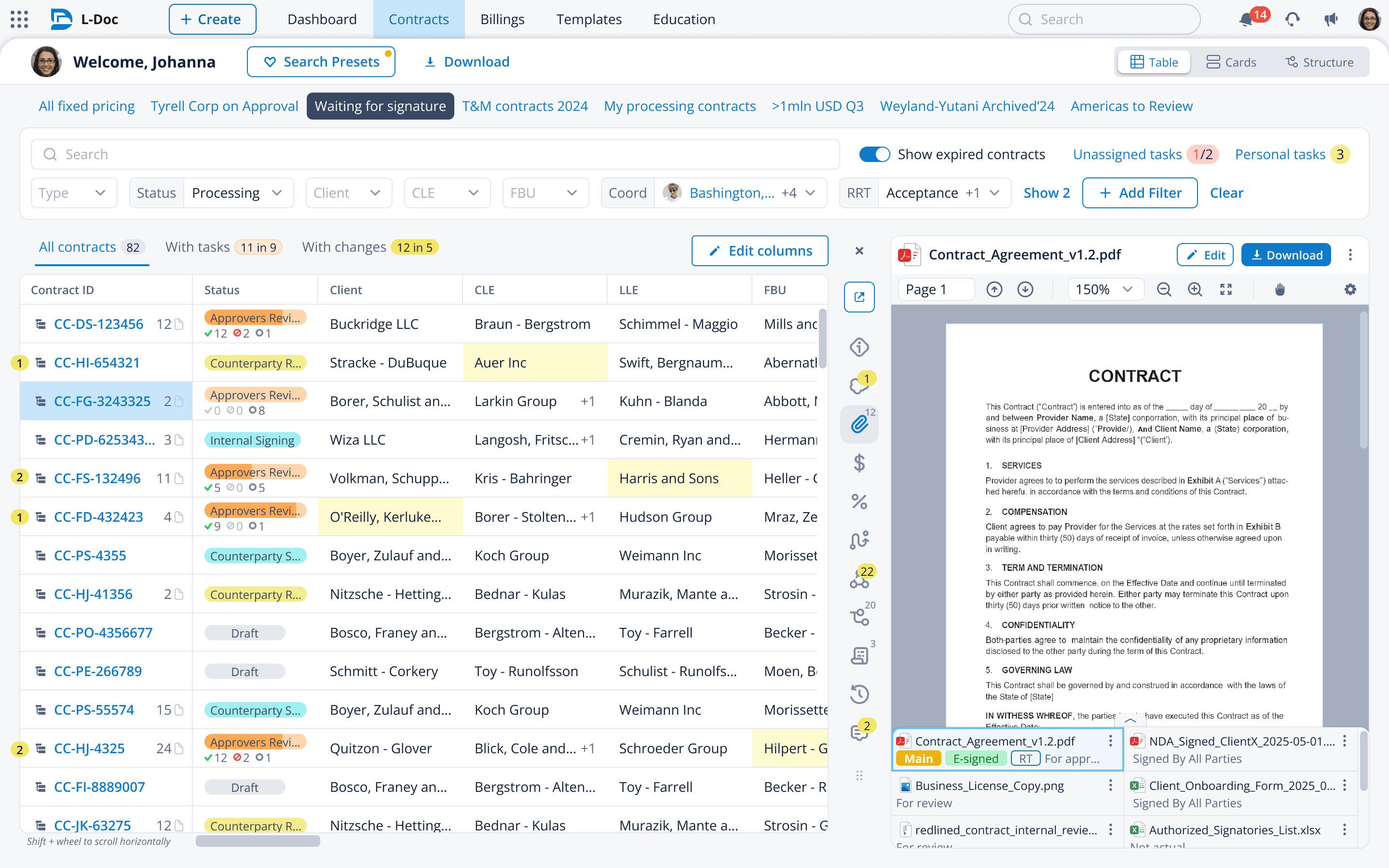
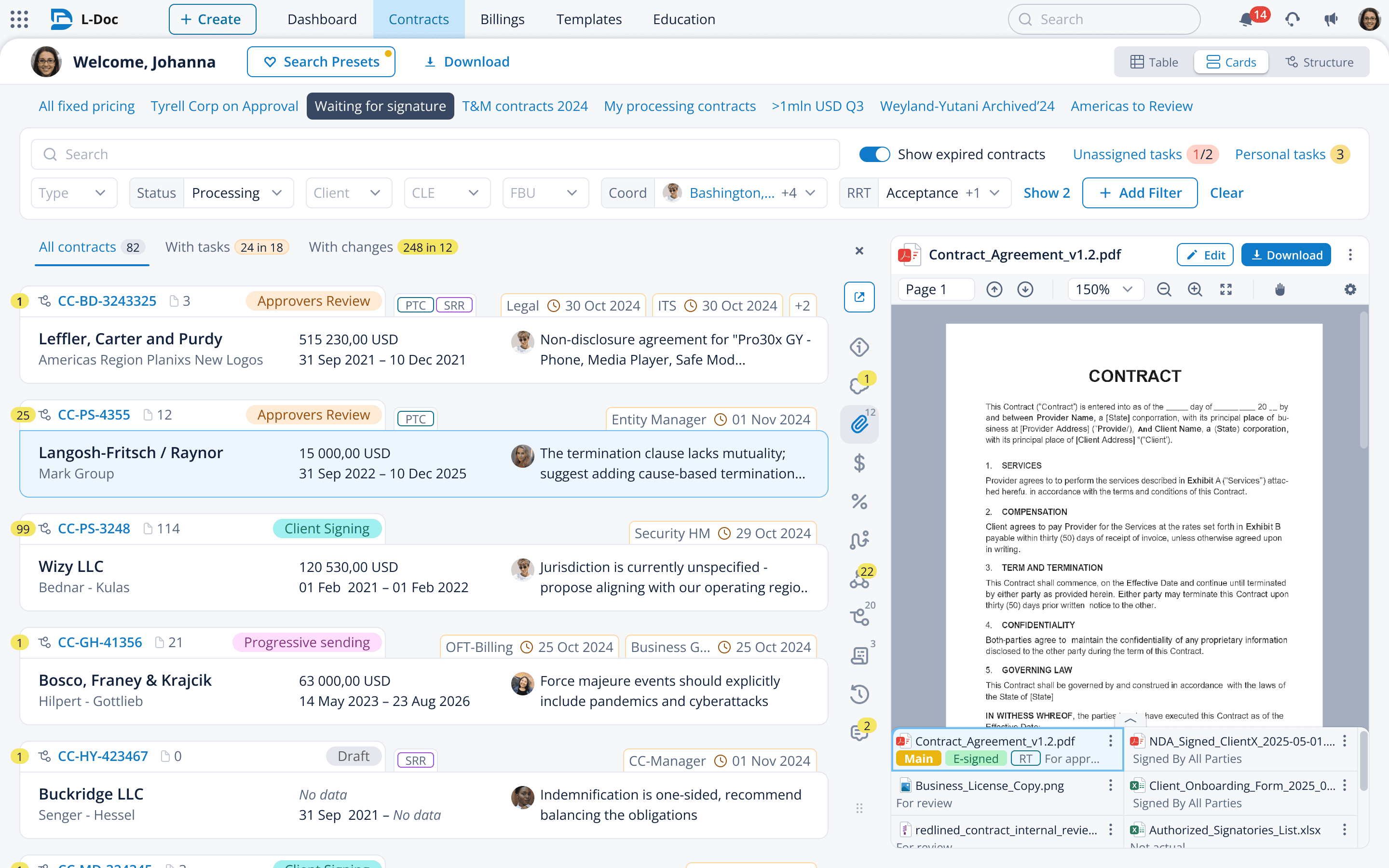
- Fully designed a system for 3,000+ legal specialists, speeding up contract management by 40% vs the legacy system,
- Built AI UX flows to parse and autofill contract data, speeding up legal clause filling and review by 80%,
- Developed reusable features for 4 other systems, cutting design time by 90% and development by 50%,
- Added full role-based customization that kept users in-system and reduced third-party tools usage and costs by ~80%,
- Designed features that improved the legal department's standing within the company and with partners.
Users
We had 2 user groups within the company interested in speeding up the processes:
~ 2000 contract managers handling deal processing,
~ 1000 specialists verifying contract legality.
Challenges
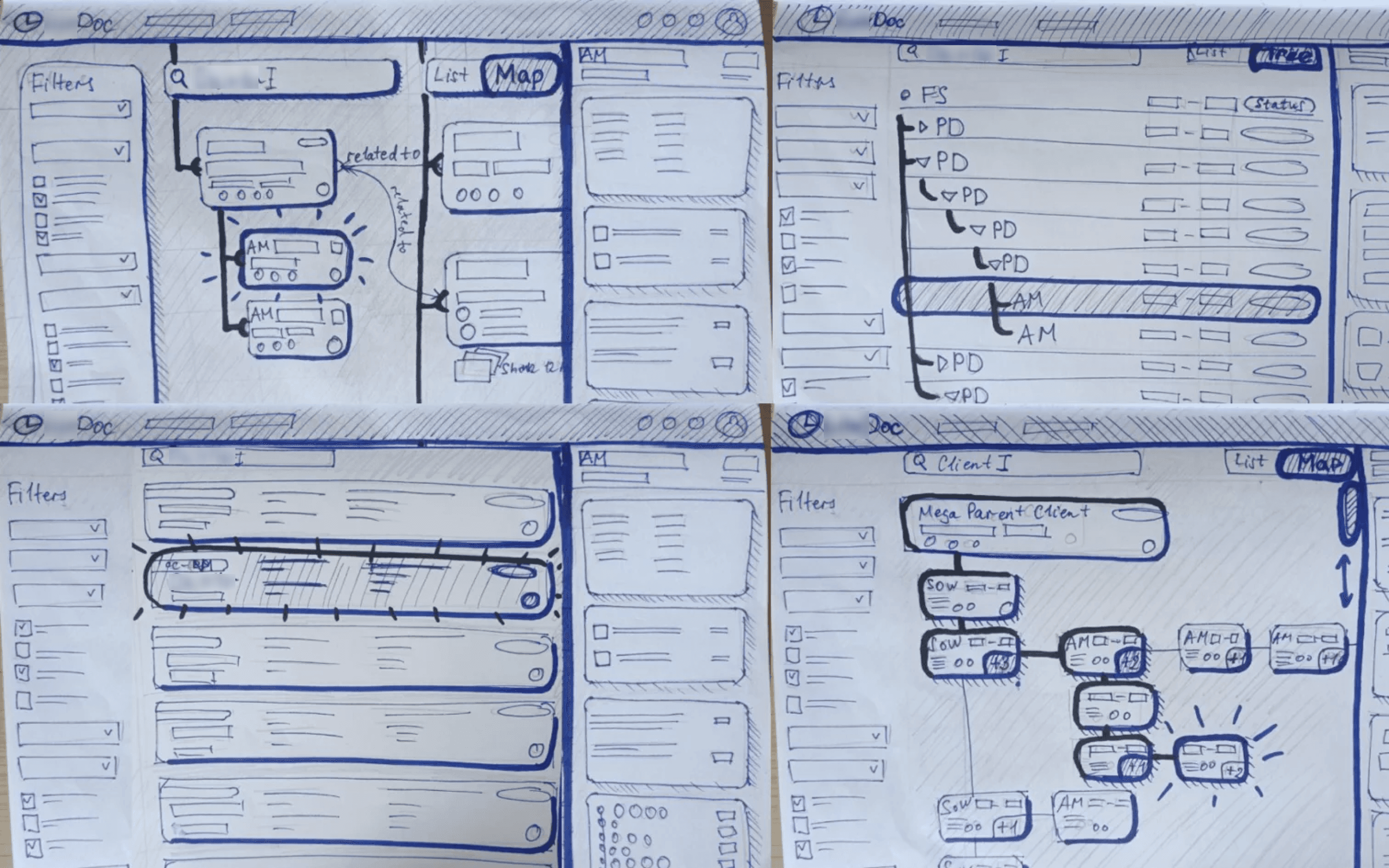
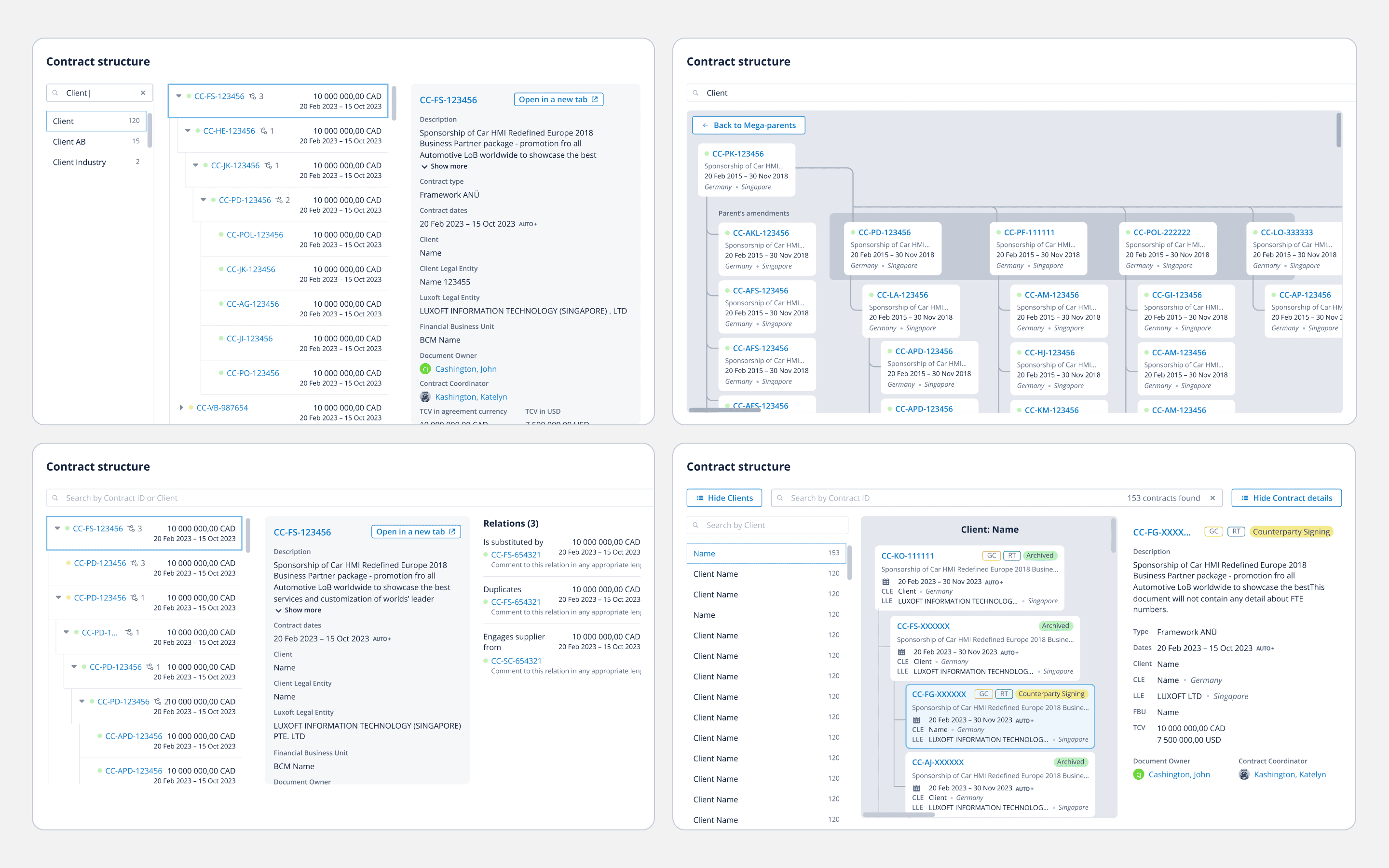
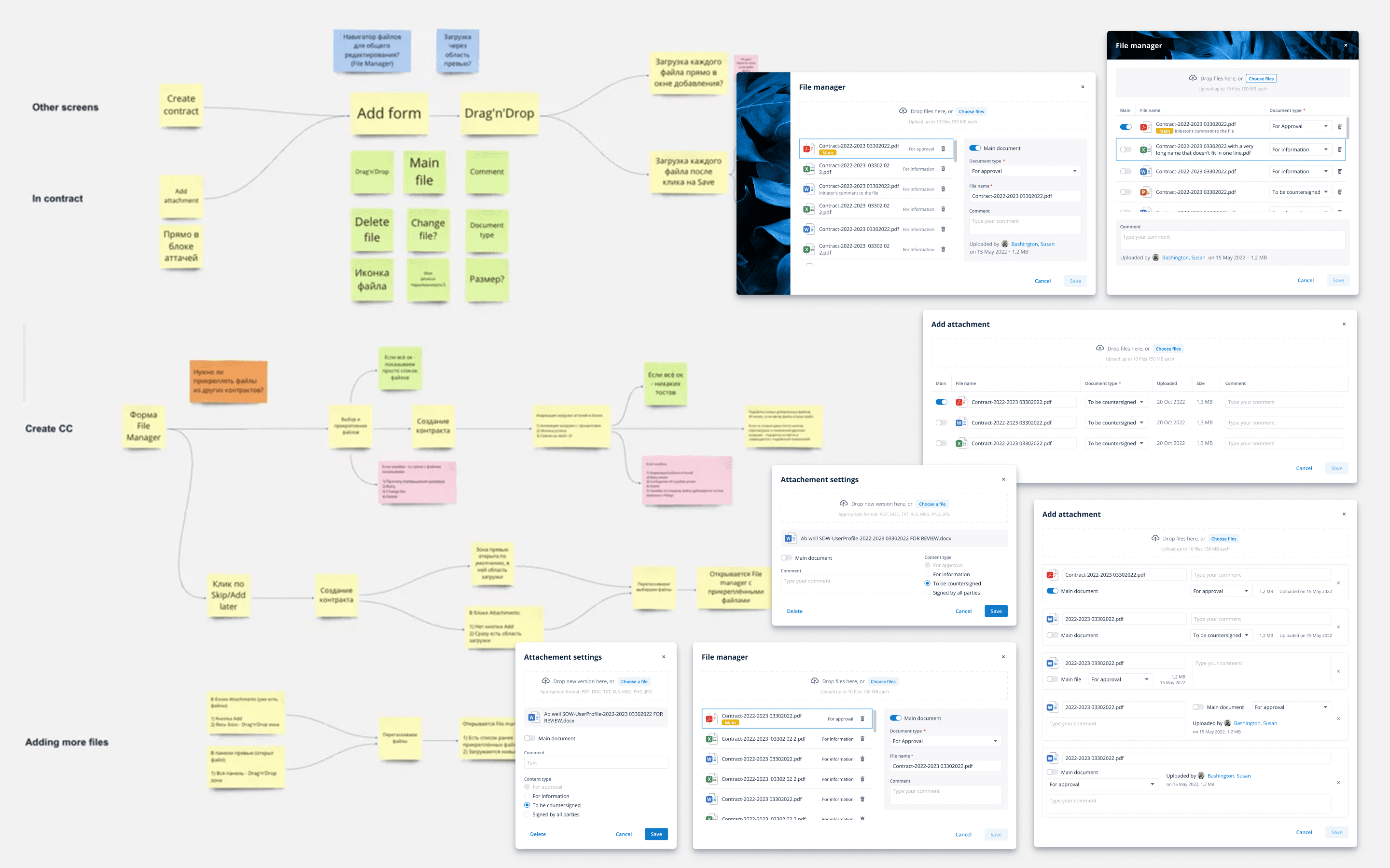
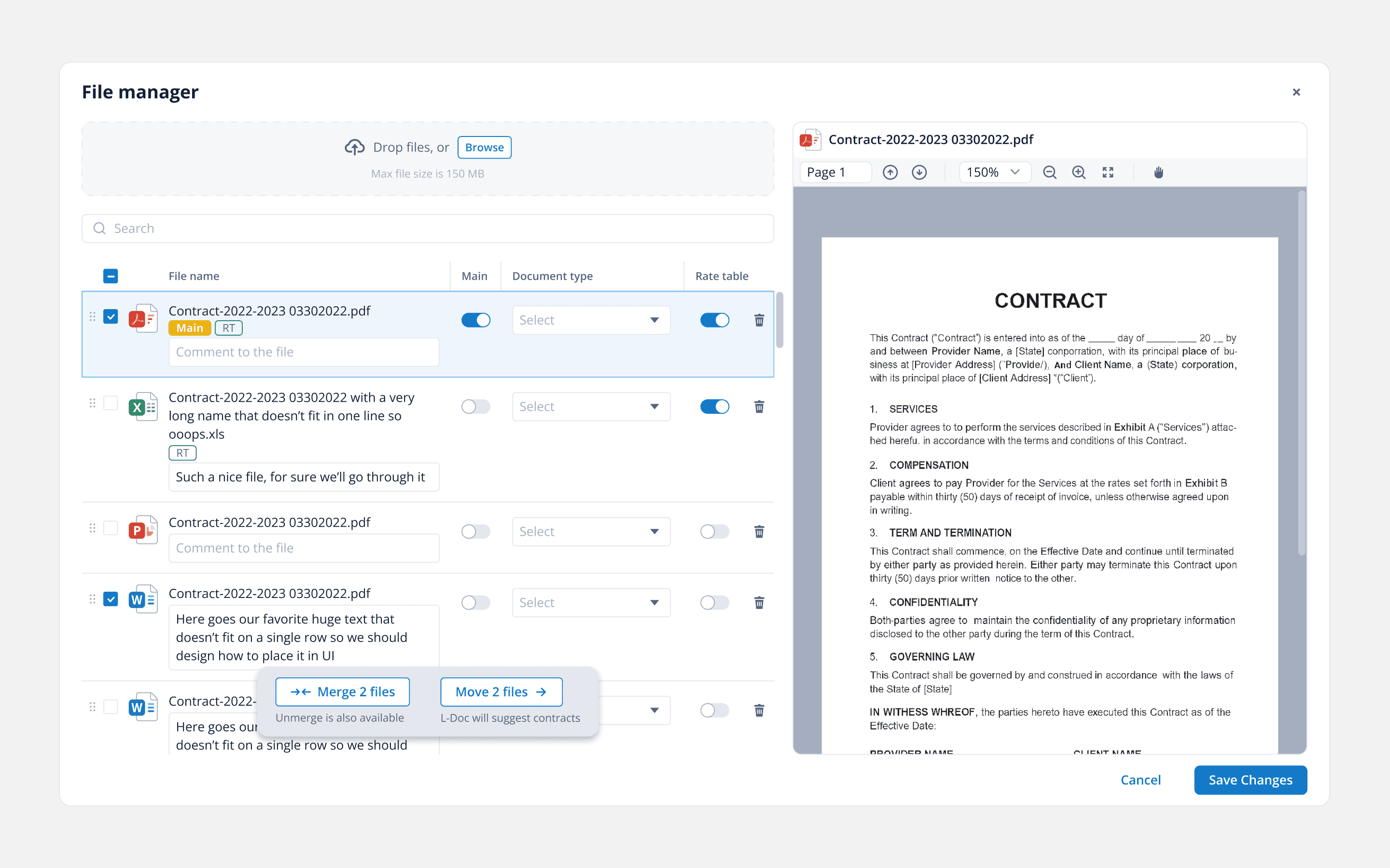
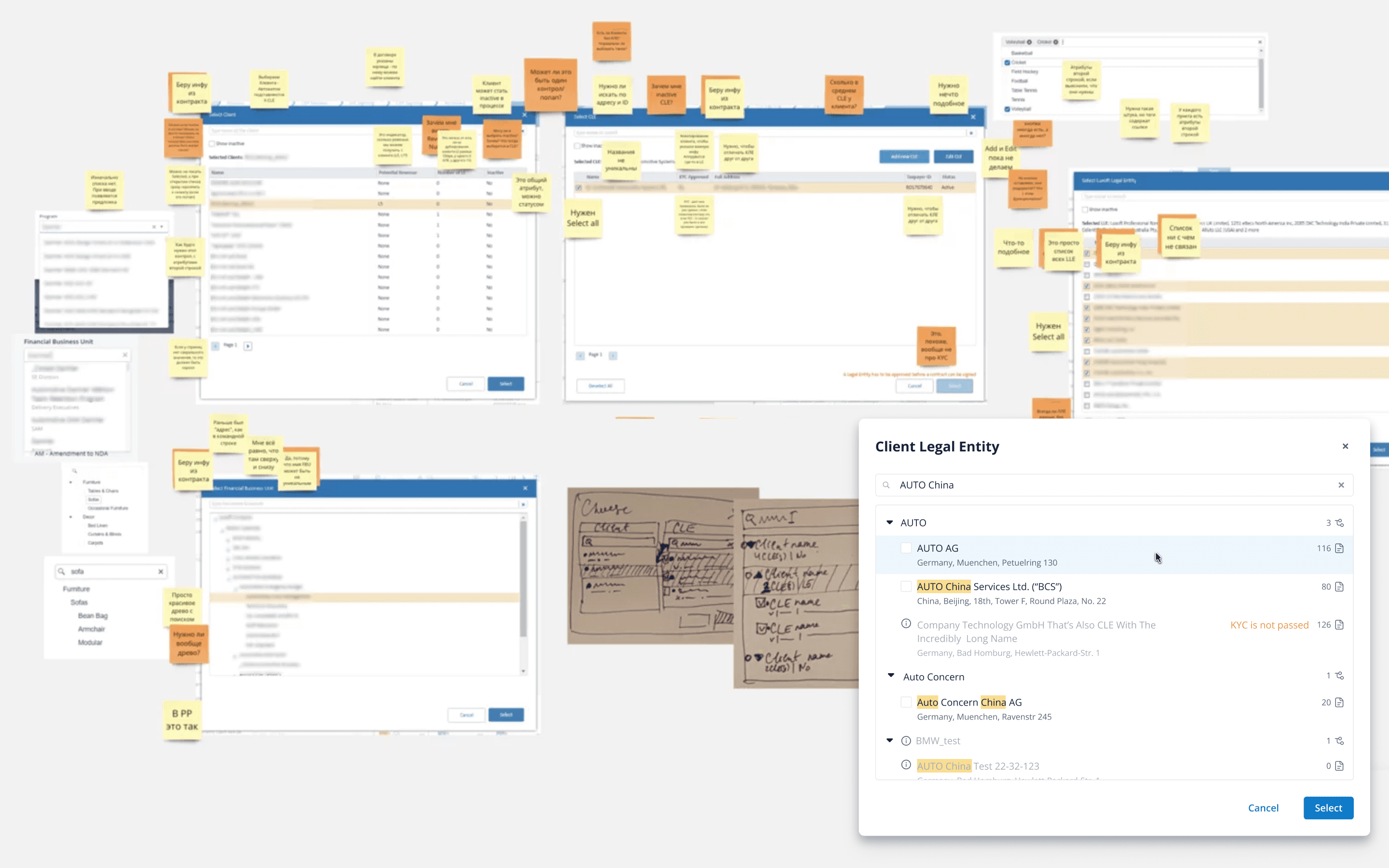
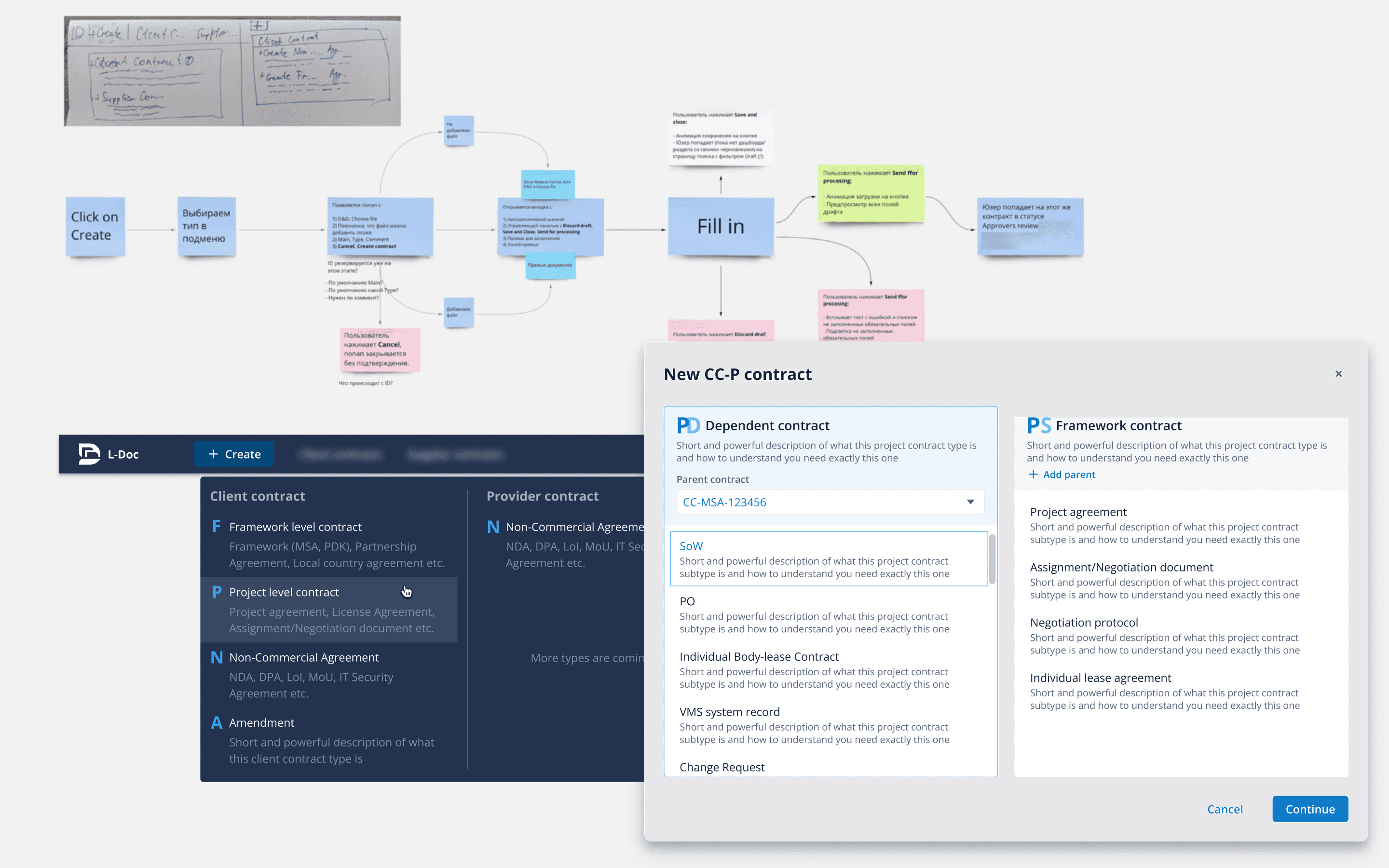
- Users were entrenched in the old system, despite its inconsistent UX and business flow. To streamline contract signing, we untangled existing processes, revamped business logic, and introduced human-centered design,
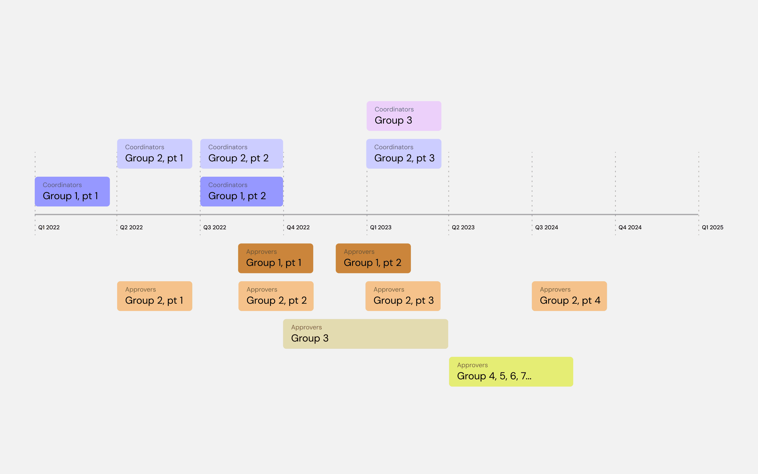
- Transitioning systems wasn't a simple switch. We navigated through multiple launch stages - MVP, alpha, beta - while integrating two systems running simultaneously.